


TradingKey - The adjustment of tariff policies by the Trump administration triggered turbulence in the commodities market. After Trump pushed forward plans to impose tariffs on industrial metals such as steel and aluminum, panic quickly spread to the copper futures market.
On February 10, local time, the price of copper on the New York Mercantile Exchange surged by 2.6%, reaching a record premium of $920 per ton compared to copper futures on the London Metal Exchange (LME). Since Trump's inauguration, investors have been keenly monitoring the potential impact of tariff policies, leading to a significant increase in NYMEX copper prices, which have risen over 10% this month, with premiums over LME copper prices continuously increasing.
So, how can one find direction in the commodity markets?
Technical analysis serves as both a "telescope" and a "microscope," enabling you to see broader market trends while capturing critical turning points. Whether you are investing in oil (WTI), gold (XAU/USD), or agricultural products, understanding these fundamental principles can help you navigate through complex price fluctuations.
Previously, we discussed charts and technical analysis of forex trading; these chart patterns remain consistent across markets. Here we will briefly outline several key chart patterns and technical analysis indicators once again.
.jpg)
(Source: Freepik)
What Are the Chart Patterns?
Trend Patterns
- Uptrend
When you see prices continually "climbing," with not only higher peaks consistently being established but also increasingly higher lows during each pullback, this signifies an uptrend.
An uptrend often indicates a supply-demand imbalance.
For example, in the case of crude oil, when the global economy is recovering and demand for factory operations and gasoline surges, if oil-producing countries cannot keep up with supply, oil prices are expected to trend upward.
- Downtrend
In contrast to an uptrend, a downtrend is like sliding down a slope—prices are continuously falling, with new lows being established and the height of each bounce becoming increasingly lower.
This is often due to market oversupply or deteriorating expectations for the future of the commodity.
- Sideways Trend (Range-Bound)
A sideways trend, also known as range-bound movement, occurs when prices seem trapped within an invisible box.
There is a ceiling (resistance level) above and a floor (support level) below, with prices oscillating back and forth within this range.
Reversal Patterns
- Double Top Pattern
If you see that prices increase to a certain level but fail to reach that same height twice—forming two adjacent “peaks” with a “valley” in between—this is known as the double top pattern (also referred to as an M-top).
The horizontal line connecting the valley between the two peaks forms the neckline. When the price drops below this neckline, it signals that the uptrend may be coming to an end and a downtrend could potentially begin.
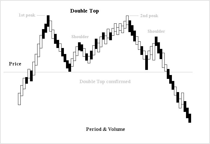
(Source: Wikipedia)
- Double Bottom Pattern
Conversely to the double top pattern, a double bottom pattern (W-bottom) appears at the end of a downtrend.
The price declines twice to the same range before bouncing back up again—this forms two “valleys,” while the high point in between serves as the neckline.
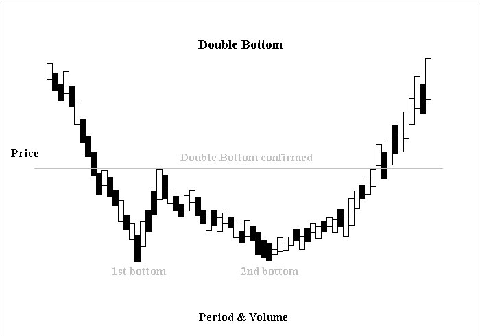
(Source: Wikipedia)
- Head-and-Shoulders Pattern (Top)
This is considered a reliable reversal pattern that typically forms gradually during an uptrend.
A head-and-shoulders pattern resembles a person standing on top of a mountain: on one side, there’s the “left shoulder,” in the middle, there’s a higher “head,” and on the other side, there’s the “right shoulder.”
The neckline connects from low points after retracements on both shoulders.
When the rice breaks below this neckline, it signifies that an excessively heavy "head" has caused instability in balance and thus begins to reverse the trend direction.
A key feature of this formation is that "the head is taller than both shoulders," along with trading volume on the right shoulder being significantly lower than that on both the left shoulder and head, indicating diminishing bullish momentum.
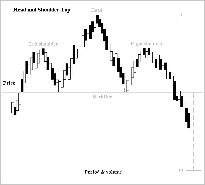
(Source: Wikipedia)
- Inverse Head-and-Shoulders Pattern (Bottom)
The inverse head-and-shoulders pattern is essentially a mirror image of its counterpart at peak formation; it appears at the end of a downtrend and is also referred to as "inverted head-and-shoulders."
Price first drops below forming its “left shoulder,” then creates new lower lows for its "head," before rebounding into forming its “right shoulder.”
The neckline connects from high points after rebounds on both shoulders.
When the price breaks above this neckline, it signifies strong bullish potential, indicating that bear resistance has been breached by buyers from below and acts as a strong reversal signal.
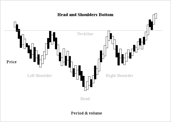
(Source: Wikipedia)
What Are the Technical Indicators?
Fibonacci Retracement (FR)
You may have heard of the "golden ratio," and Fibonacci retracement is its application in the stock market.
This tool is based on a series of remarkable numbers (23.6%, 38.2%, 50%, 61.8%) that help you identify “natural support and resistance levels” within a trend.
How to Use It?
For example, if crude oil rises from 60 to 80 and you want to find buying opportunities on a pullback, you can apply Fibonacci lines on the chart by extending from the lowest point (60) to the highest point (80). When prices pull back, they are likely to stabilize around 38.2% (72.36)or 61.8%(67.64).
Bollinger Bands
Bollinger Bands function as "elastic boundaries" for prices and consist of three lines:
Middle Band: The 20-day moving average (indicating trend direction)
Upper and Lower Bands: Central band ± 2 standard deviations (indicating volatility limits).
These three trend indicators can provide insight into market conditions:
Strong Trend: Prices are close to the upper band, and the bands are diverging upwards (as seen when Tesla stock soars), indicating bullish strength—don’t short too easily.
Weak Trend: Prices hover near the lower band, with bands diverging downwards (e.g., during a significant decline of a delisted stock).
Consolidation: The bands flatten out with prices oscillating between them (like gold in a sideways market), which is suitable for buy-low-sell-high strategies; breaking out of this range may indicate a change in direction.
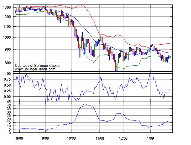
(The image above shows red for the upper band, blue for the middle band, and green for the lower band;The middle image represents %b values (relative position of closing prices);The lower image illustrates bandwidth indicators (the distance between the upper and lower bands).
(Source: Wikipedia)
Moving Average (MA)
Short-Term Moving Average (10-day): Reflects short-term sentiment and is suitable for short-term traders.
Long-Term Moving Average (200-day): Indicates long-term trends and acts as a dividing line between bull and bear markets (e.g., Moutai’s stock price often remains above its 200-day moving average).
Relative Strength Indicator (RSI)
The RSI measures market buying and selling power by comparing price changes over a certain period, with values ranging from 0 to 100. Standard overbought/oversold thresholds are generally established at 70 and 30.
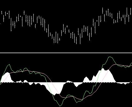
MACD
MACD consists of two lines and several histogram bars:
Fast Line (DIF): Short-term MA - Long-term MA
Slow Line (DEA): Moving average of the fast line
Histogram Bars: Difference between DIF and DEA (red bars indicate bullish momentum, green bars indicate bearish momentum)
Three Key Signals:
Golden Cross / Death Cross: When the fast line crosses above the slow line, transitioning from red bars to green indicates sell signals; conversely, when it crosses below indicates buy signals.
Divergence Between Peaks/Troughs: New price highs without corresponding new highs in MACD indicate bearish divergence; new price lows without matching lows in MACD suggest bullish divergence.
Bar Scaling: An increase in the length of red bars suggests strengthening bullish momentum, while decreasing length may suggest weakening; this applies similarly to green bars, indicating bearish pressure.
(Source: Wikipedia)
